Heckler Branding’s Tye Heckler speaks to Tobias Pearce about the importance of impactful branding, getting it right from day and making sure your logo stays fresh
If a picture tells a thousand words, then an impactful logo should communicate a complex brand narrative in moments. For a coffee business seeking to build successful branding, the advice from Tye Heckler, owner of brand design agency, Heckler Branding, is simple: Find a compelling name and secure it with a trademark from the outset.
“It is fundamental; find a unique name, and trademark protect it from day one. Never worry about it again and move forward. It is far more painful and costly to conduct a name change after you’ve been operating versus getting it squared away from the start,” he says.
“We made the siren symmetrical, and it was at this point that the Starbucks green and black was introduced”
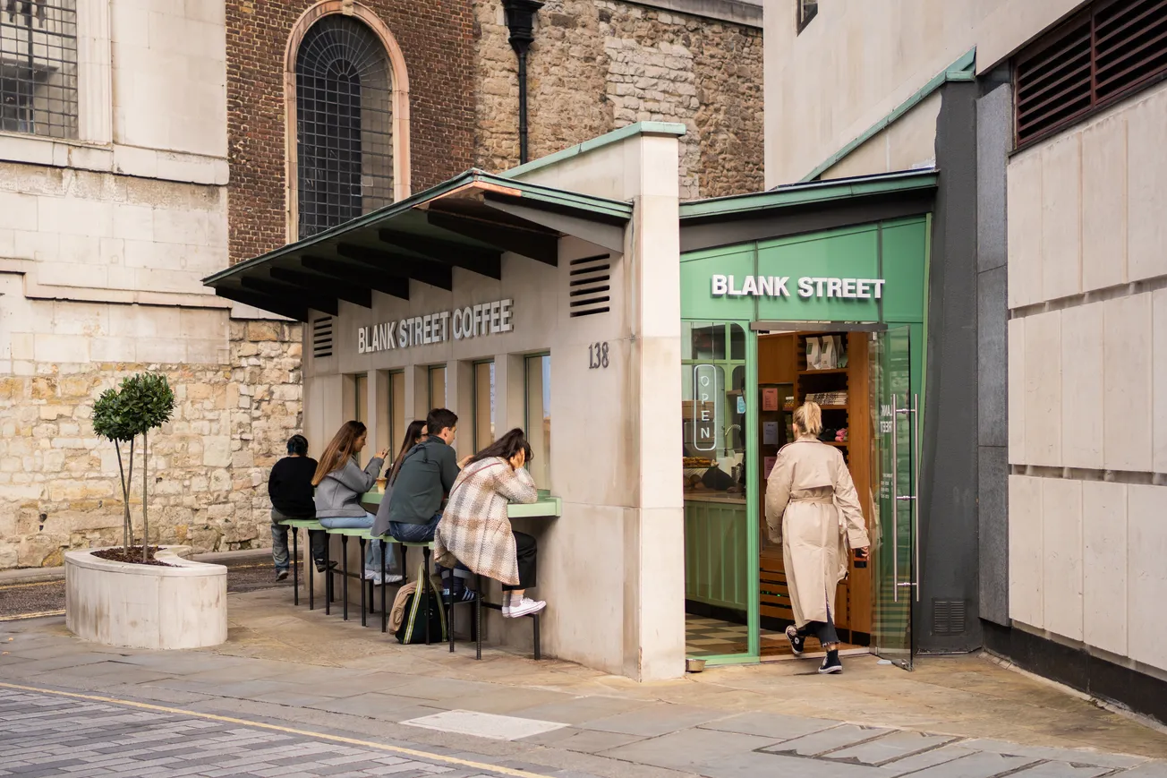
Heckler knows more than most on the subject of successful branding in the coffee industry. His company’s work includes developing brand identities for household-name hospitality businesses, including Starbucks, Cinnabon, Panera and Le Chatel, as well as having worked with technology giant Microsoft and Redhook Ale Brewery, to name but a few.
Once a brand name is set in stone, Heckler advises coffee companies to review their branding around every ten years to evaluate how the brand can evolve in the context of market development. It’s a process that even the largest and most formidable brands of today have been through, and one from which lessons can still be learned at levels of the coffee industry today.
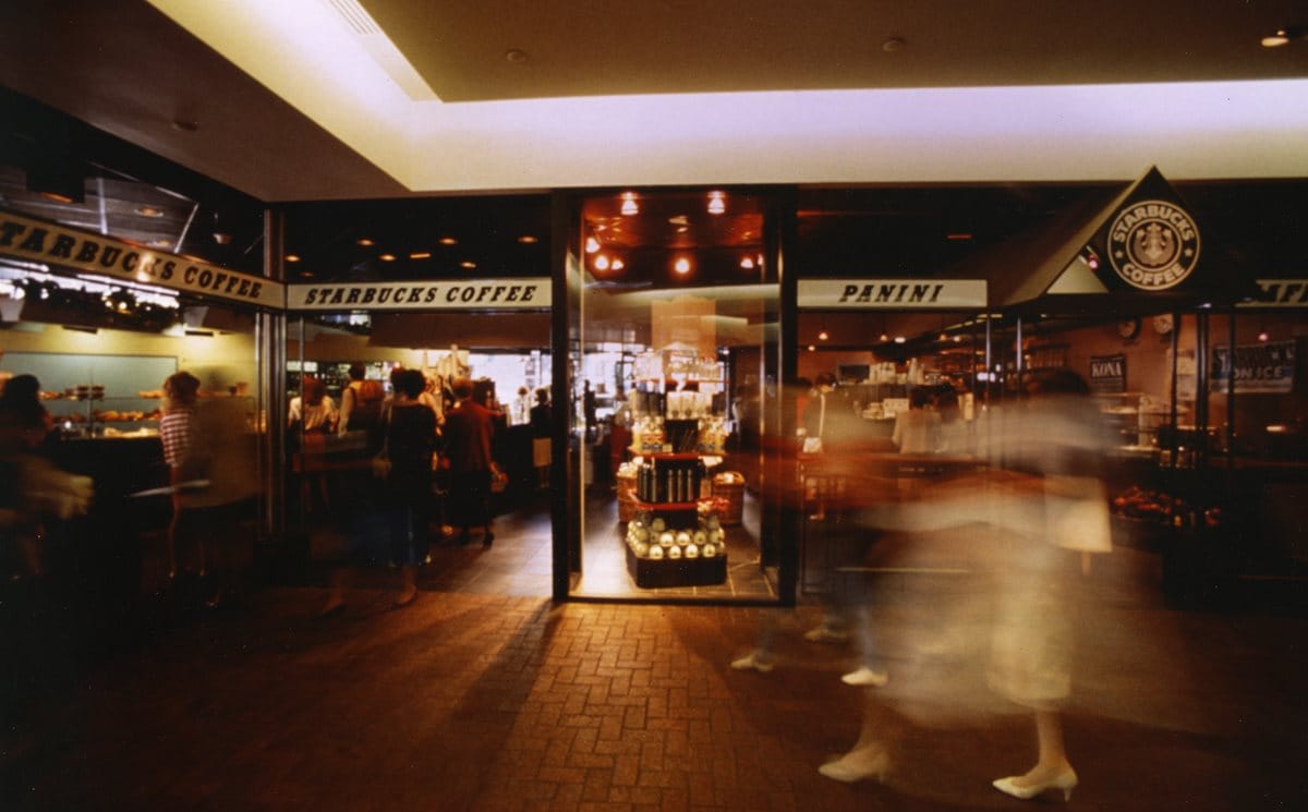
When Heckler Associates (now Heckler Branding) was established by Tye’s father, Terry, in 1969, one of the company’s first customers was a new premium coffee start-up based in Seattle’s Pike Market.
Wanting to base their coffee business on a nautical theme, the founders initially named the company ‘Pequod’ after Captain Ahab’s whaling ship in the novel Moby Dick. However, realising the name didn’t quite have the desired ring to it, they eventually settled on ‘Starbucks’ after the ship’s young chief mate on the advice of Terry Heckler.
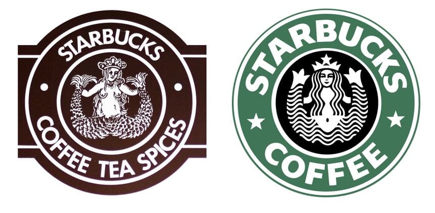
“The rest is history,” says Tye Heckler. “The original Starbucks logo design dates to 1971. It was a two-colour brown and white design solution, which Starbucks used for around 15 years.”
“There were several iterations over the years. In the late 1980s, the logo was updated again. We made the siren symmetrical, and it was at this point that the Starbucks green and black was introduced.”
What’s in a name? It just goes to show that when it comes to building successful branding, the answer is everything. Once that central kernel of identity is in place, a flexible, modular approach to deploying logos and typeface can give fledgling coffee brands the impactful start in life they need.
It’s an approach that has been tried and tested by some of the world’s most successful companies, and enabled them to not only become successful businesses, but also important cultural influencers.
“In the 1970s, North America was far behind Europe when it came to coffee,” says Heckler. “It’s just amazing how coffee culture has proliferated over the past 50 years, and Starbucks has been a central player in that.”
